“Is there a secret recipe for the top performing e-commerce sites?”

If you own a small business, odds are you’re looking for ways to improve customer satisfaction and improve sales. You probably already have an e-commerce website to help you achieve those goals. Unfortunately, far too many small business websites simply don’t work. Some lose prospective customers because they don’t work on mobile devices. Others have weak or no calls to action. Some are just poorly designed.
Is there a secret recipe for the top performing e-commerce sites? Do they all have something in common? Surely their success is not an accident. How do they do it? Let’s take a look at the tricks of the trade that are being used by the sites who are generating sales like crazy. Here are 6 elements of 2016’s top performing websites. Tap into these best features to improve your website:
Clarify your goals and measure results:
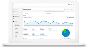
you wouldn’t start a business without a solid business plan and clearly articulated, measurable goals. Without a plan, you don’t know what success looks like. In the same way, you should have clear goals for your website. Is your goal to increase sales, and, if so, by how much? If you have an e-commerce site, what kinds of online sales do you expect, and for which products? Once you’ve decided what your goals are, you need a plan to measure results. One of the best available tools to do that is Google Analytics, which has the added advantage of being free.

First Impression of your Website
What happens when customers arrive on your landing page? Do a test run and see if these elements are integrated into your web page:
- Explanation of why consumers should purchase your product or service.
- Up-sell option to other products or services that might interest a browsing consumer.
Lead Conversion With Creativity
Again, go back to your landing page. Is it boring or captivating? Does it convey an image consistent with your brand strategy? In other words, are your selling stimulating coffee yet have as a feature image a relaxing hammock swaying in the ocean breeze?
But you must go further than consistency between landing page design and brand. Is your landing page just downright boring? Does it seem outdated?
Today’s top performing websites are taking advantage of the power of video. Videos lead to conversion rate craziness. Try more than 80%!
Cultivating Consumerism Engages E-commerce
Rather than a hard-sell, which can be quite a turn-off, does your landing page gently cultivate consumerism? Clicking on the “shop” button should be as comfortable as slipping into a cozy pair of your favorite slippers. Tantalize, tease and titillate visitors to slide on over to the shopping cart. This strategy is called a soft close and it is highly effective.
This is when a marketing strategy leads the consumer to believe that their purchase has been an act of their own rather than being led down the yellow brick shopping road by a marketing message.
The Need For A Good Cause
Consumer activism is alive and well with today’s online audience. No where has consumer activism’s voice been heard the loudest than in the food industry. In order to succeed, the food industry has had to re-model their branding in response to public health concerns and the influence of celebrity spokespersons who are leading the charge for better nutrition.
The clarion call of consumer activists also goes beyond the product itself. They want to know if components are sustainably and ethically sourced. If a company is also altruistic, sponsoring a favorite charity, that’s even a plus. Your website may be in need of a good cause.
Clear As A Bell
You may want to try an uncluttered modular design if you want visitors to relax and stay awhile. Although you want to immerse your visitors into what you offer in goods and services, there is a delicate balance between delivering a variety of interesting information and overwhelming them with clutter.
The proof of clutter as a turn-off is in how many options exist for minimizing ad clutter through browsers like Firefox or information managers like Outlook.
Don’t Be Afraid Of Change
Nine Line Apparel was selected as one of the top performing e-commerce website designs in 2016. The company’s graphic designer stated that the company is “constantly changing” its website. Their most recent revamp resulted in an increase in conversion rates by 4-5%. The market is always changing so why shouldn’t your website?

Re-designing a website is quite an undertaking. However, the investment can lead to a big payday when all is said and done. For the best results, leave it in the hands of professional web designers while you continue to focus on what you do best, run your business. Review portfolios of the top professional designers and get a free quote on a revamp of your e-commerce site today.
Make your site mobile-friendly
According to Hubspot, internet users now spend about 66% of online time on mobile devices (like smartphones and tablets), and 40% of mobile searches are sales related.  If you haven’t implemented responsive design, you’re probably losing those prospective customers. Responsive design means that your site will automatically conform to any device, whether a laptop or a smartphone, so that content is easy to access.
How important is responsive design? According to Google, a whopping 61% of mobile users will leave your site if they’re frustrated on can’t find the content they’re looking for.
Transitioning to responsive design can be complicated—your best bet is to find a competent designer to do the work for you.
Make your site informative and easy to use
You have to remember that customers engage differently with websites than they do with print information. They expect content to be concise and clear: on average visitors read only 28% of the words on a web page, so it’s important to make every word count, and to put your most important copy above the fold.
It’s also important to use persistent navigation, which means that your main page links appear in the same position on every page. Finally, be sure to give site visitors the information they want: almost half of website visitors will leave a site if they can’t find contact information, and 86% want to see information about products and services on the homepage.
Nurture your site with fresh content
Your business is constantly changing, and those changes should be reflected on your website, from new products to new employees to new ad campaigns. Fresh content tells customers that your business is active and thriving, and that you care enough about them to make sure they have the most up-to-date information.
When customers see new content, they’re more likely to engage with your site and respond to calls to action. Equally important, fresh content will help you achieve better rankings in search engines like Google.
Conclusion
Your website is a key component of your business marketing strategy. Get the most out of your site by employing best practices like outlining your goals, implementing responsive design, making sure you make it easy to access the information your customers are looking for, and keeping your site up-to-date.
If you are considering creating your own e-commerce website, read this article on pros and cons of hiring a professional e-commerce web designer.
Even if you think your website is doing everything you want it to, it’s always a good idea to make sure you’re engaging in best practices to achieve optimal results. Ready to get started? Then you can find a web designer now.
