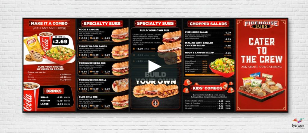
A fine dining experience is enhanced by many things, one of these being the design of the restaurant menu. Customers can make a well informed satisfied choice that stimulates the appetite by simply looking at the menu.
A menu is more than just a list of dishes that a restaurant offers. It is an advertising tool able to communicate the identity of the restaurant and drive profits if only it is well-designed. The design of the menu is important because it’s what draws customers to the restaurant first.
Understanding the critical requirements of a menu is important to getting your restaurant up and running. We will discuss the strategies that help your menu design increase your profit margins.

Strategies to design the best restaurant menu boards
- Become aware of the eye scanning patterns – For many years, restaurants have always gone wrong by thinking that every customer is drawn to the sweet spot on the menu. New research suggests that customers read menus like a book, starting from the top left corner. Now you know where to place your top priority foods.
- Divide the menu into logical sections – Don’t just cram everything in there and call it a complete menu. Learn the art of arranging items sequentially and in logical groups as this makes it easy for the customers to view their favorites easily.
- Use photos sparingly – Due to unnecessary use, photos of food are associated with junk mail fliers and big chain restaurants, not high-end ones. If you have to use photos on your restaurant boards, then use them sparingly. Ensure they are of high quality, which may be costly but worth the cost. In general, better leave the quality of the food to the customer’s imagination; don’t try and sell it because they will not buy it.
- Consider using illustrations – Instead of photos, use illustrations more. They are more likely to be more universally appealing and help communicate to the restaurant’s personality.
- Do not put emphasis on currency signs – Making customers aware of how much they are spending is a great sin in any business. Studies have clearly shown that customers are more likely to spend more when the currency signs are omitted.
- Consider drawing boxes when organizing your menu – Boxes draw attention to a bunch of menu items grouped together. These boxes will help you promote dishes with the highest margins like carb-based items.
- Choose appropriate colors – Select your colors based on your target audience and the theme of the restaurant. Different colors have different psychological effects on viewers, so choose a color scheme that will help set the mood as well as draw attention to certain foods.
Strategies to display your restaurant menu
Menu boards are not only used to advertise food and beverage options but also to complement the event ambiance and décor. There are many suggestions on how to enhance your next menu and these are a few clever ways to display your restaurant menu:
- Chalkboard – A chalkboard is common and shows off such artistic skills by using chalk and the normal board. This design is great for creative sidebars that create a more personal and welcoming message. Illustrations can also provide a more homemade charm, which is a great idea for locally made foods or handcrafted beverages.
- Butcher paper – Butcher paper is not commonly used in many events; it is limited mostly to simple events. The details can be written in a fun yet an engaging way that is attractive. The butcher paper is commonly used for lunches and cheese tasting events.
- Frames – Picture frames are versatile décor items that can be used both simply and elegantly as the event calls. Menus can be printed in the appropriate size or handwritten directly on the glass. You can then have the frames stand or affix them on a post for elevated displays.
- Digital – The 21st century has come up with an easy way to make menus colorful and professional. You can use colorful images and videos to draw attention to the menu items as well as highlight the hosts or the restaurant’s info with digital signage. Be sure to design either horizontally or vertically for placement flexibility.
- Outdoors – Although weather elements may call for healthier options, it doesn’t have to be boring. You can use creative ideas like a large wooden frame that is attached firmly to a tent to secure it and display the menu. A sandwich board can also be creative enough to provide a customizable option that can easily stand on its own.
Bottom line
Be educational. On all your menus, whether restaurant or other events, chose to educate your customers about the food calories and nutrients that you are serving. The educational part will always bring your customers back many times to learn more as they enjoy their favorite dish.
Bio:
Karen is a Business Tech Analyst. She shares strategies to make the best restaurant menu boards and is very responsible towards her job. She loves to share her knowledge and experience with her friends and colleagues.
This website is hosted on AWS and hosting services are provided by Entexture.


One thought on “Essential Restaurant Menu Design Tips To Make Your Business Better”
Nice thought. Must have such kind of menus. Love this.